catching up with project life
Don't worry.
If you are a project lifer you are never behind.
I take great comfort that AliEdwards is catching up on last year's book.
Today I am sharing some ideas from an April page I just finished.
So here is a free tip: You are never behind. Just always enjoy the process and tell your story. That's it.
You may proceed with your day now.
Oh..but wait...read this first:
Today's post is about 5 ways I go about making my month-at-a-glance page. This is new to this year's project life approach. I love having this page at the 'beginning' of each month in my album. Here is how it goes.
First. Grid page. The first page for a new month in my family album is (right now) a grid page. I crop my photos to about 3-inches square. Then I just use a grid sketch to place these on this opening page. It's clean. There is plenty of room for how many photos will make the cut to this page. And it is consistent with the rest of my album. And right now I am really liking that idea.
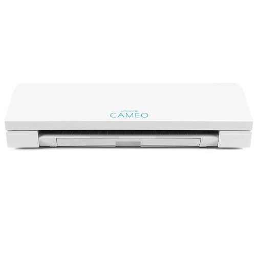
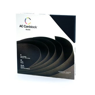
Second. Monthly title. Again. This is consistent. I decide for all my albums how the dates will be represented and I always try to go with the same thing from month to month. For here I am using the Heidi Swapp Month png's. I just bring them into my Silhouette software, trace them, and cut on black textured cardstock. This brings a super clean look to this grid page. As well it also adds style and flair. And I like it!
(edited to add: Heidi Swapp Month Cut Files are not presently available. I will update when I can get a link for ya)
Third. Highlights only. The month-at-a-glance grid page is just a highlight reel. It is only the photos that stick out to me as I go through my photo folders. These are the stories that say, 'you really want to remember this'. So these photos get the cut and make it to the highlight page. Super happy I decided on this format. Honestly, I could be done at this point. The scrapbook pages that follow this grid page are singular and focused stories. But this highlight reel is awesome to me.
Fourth. Fairly simple embellishments. See YESTERDAY's post for some details on this. But this page is easy on the embellishments. I keep them mostly consistent from month to month. While I am a 'make it pretty' girl kind of girl, this page is not about that. It's just about the photos. If I fill in all the grid spaces and have no embellishing, that's OK too.
Fifth way to craft a month at a glance:
No journaling. Wait! Hold the phone! What did I just say? No journaling. THAT is just what I said. For this intro to the month highlight reel grid layout page, there is no journaling. I journal the details on another page. This is just photos. Light embellishment. The month to date the page. And sketched out in a grid. That's it! Did I tell you this makes me happy?
Crafting a month-at-a-glance page tells so many stories all in one place. It gives way to other stories to follow if I wish. But for the most part, it does indeed get the stories down in my family 'project life' album. For always. And that is a great way to look at a month.
supplies used in this post::
Becky Higgins - Project Life - Heidi Swapp Edition Collection - Album - 12 x 12 D-Ring - Black and White Stripe
Scrapbook.com
Scrapbook.com



No comments:
Post a Comment