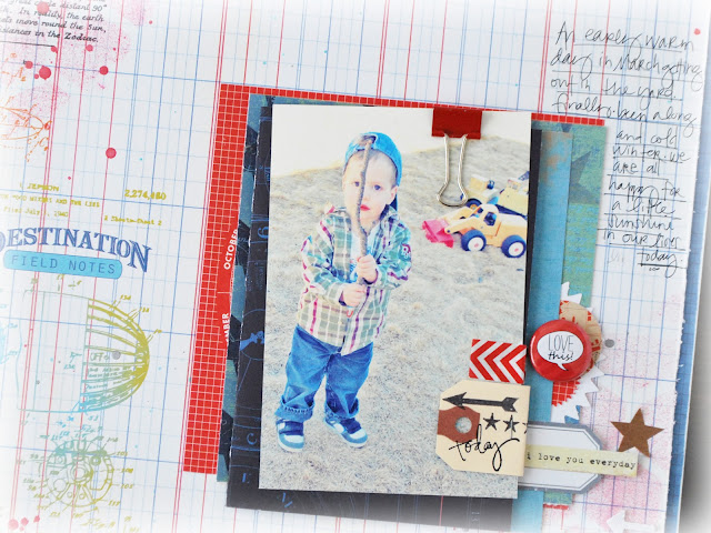
boy layouts take 3.
today i want to share the youngest of the guys in my family.
the little mr.
we were so excited to get out of doors earlier in the month.
actually...i am not sure who was more excited...me or him.
a photo opp for sure nonetheless.
are you noticing a theme here?
no limits paper. such perfect boy patterns.
color spray splotches.
stencils at play.
distressed edges.
now these are elements one can find on all my layouts...usually.
but they are really played up here for the boy look.
this layout has an interactive element to it...
extra photos that i wanted to keep with the initial layout are simply added to a 'card' made for the layout. it is just a swatch of pattern paper folded in half. it is attached to the other layers on the background of the layout, and then the focal photo is placed on top.
i love layers.
there is nothing special about these layers.
just pieces and embellishments that i pulled together with the red theme in mind.
i simply play around with them for a bit and then i glue them down.
and don't forget layers of stamp images. boy pages can really handle lots of extras and layers and splotches and even...
yes even a heart!
hope you have enjoyed this little series on the boy page.
would love for you to link me up if you are inspired to do the same.


I just LOVE when you add in the interactive elements! Fabulous layout! xoxo
ReplyDeleteYou layers are fabulous Jamie, and I do adore that little openable
ReplyDeleteAbsolutely love this layout and the red embellishments just pop. I like being reminded that sometimes simple interactive elements are all that is needed!!!
ReplyDeletelove that color combo! perfect for the photos! and loving all the little details.
ReplyDelete