Seems I do not do as many traditional layouts as I use to.
ProjectLife is one of the reasons.
Mini albums and memory files is another reason.
Love that 'scrapbooking' is not any one single approach.
I sort of get bored doing the same thing the same way all the time.
But today, I give you the traditional layout...
This layout today answers a lot of creative challenges for me.
It is a sort of ProjectLife page. More on that in another post.
It is created with the Studio Calico Sunday sketch in mind that is found here.
It is also an answer to the Trendspotting class and the challenge to use arrows.
AND..it shows off the NoLimits collection from Heidi Swapp.
A favorite collection for outdoorsy type pages.
Or layouts that show off one little guy.
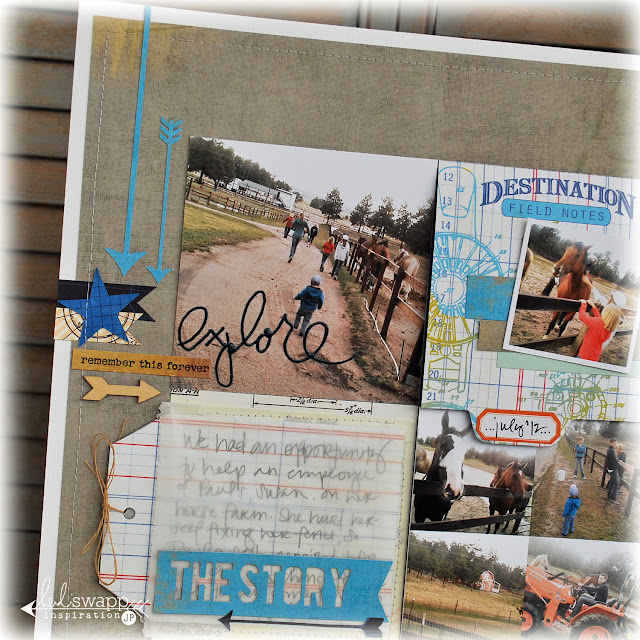
The page's foundation starts with the Schematic paper from NoLimits. It is such a great grey and could really springboard a lot of different themed stories. Using additional patterns from that collection I created a cut title using the Bebas font, as well as die cut stars and cameo cut arrows. The 'explore' is from the NoLimits BuzzWords and they are one of my favorite embellishments for using on a photo.
You might spy some of the CHA Summer release sentiment stickers from HeidiSwapp. The new collection and elements plus ColorShine will be shipping in September. I for one canNOT wait for that all to ship. It is gorgeous. The sentiment stickers are extremely versatile and you will see them a lot on my projects going forward.
The title 'destination explore' fits this page perfectly. Lots of my photos circle around the little mr. quite a bit these days. At two years old he is more than adorable, and everything is an adventure to him. He had no fear of those big o' horses on this farm we went to visit. And I loved capturing him, as well as his sister's, who absolutely adore horses, with many photos, and getting them all here on this page.
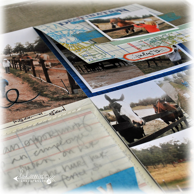
I made a mini folder on the top right quarter of the sketch that reveals more photos underneath. That inspiration comes from HeidiSwapp and her memory file technique. I very often scrap more than a single photo on my page, so making interactive pieces for more photos, or even hidden journaling, really works into my style. I will simply make slits in the page protector after I place them in their album to make them accessible.
Hoping this inspired you in some way...
to follow a sketch...
or work a trend on your page...
or to get interactive with your pages...
the possibilities are endless.


Thanks for your great inspiration. Putting just a little flap into the original sketch is so clever and it is an idea I will have to try. :)
ReplyDeleteJamie....this IS GORGEOUS!!! Honestly, i am SO IN LOVE with this layout. Everything about it is perfect. Gorgeous design girl and use of embellishments. Cannot get enough. You ROCKED this one! Just amazing. And seriously how cute are those sentiment strips?? Just lovely...you are fabulous girl. xoxo
ReplyDeleteThat mini folder is pure genius. I adore it the most.
ReplyDeleteBeautiful!!
ReplyDeleteJamie this is my new fav of yours, the simplicity really allows the photos and embellies to shine, I adore it to pieces!!!!!!!!
ReplyDeleteL*O*V*E this! the graphic elements and clean look of this design is perfection! tfs!
ReplyDeletexoxo...
~p
LOVE the layout, Jamie...and your design and layering are perfect...so inspiring...
ReplyDeleteWOW Jamie!!! This is beautiful!!! It is lovely to see a layout of yours and what a layout it is!!! I love the whole feel of it and I could stare at the details for a long time!!! Gorgeous!!!
ReplyDeleteThis is FABULOUS!! Awesome take on the sketch!
ReplyDelete